Branding, Identity
Overview
A logo balanced between business and friendliness that can be rearranged to fit into different mediums.
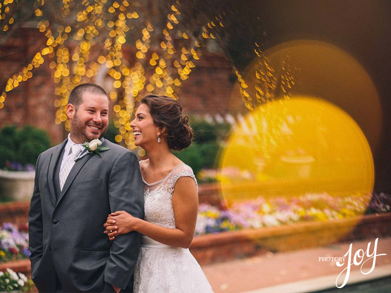
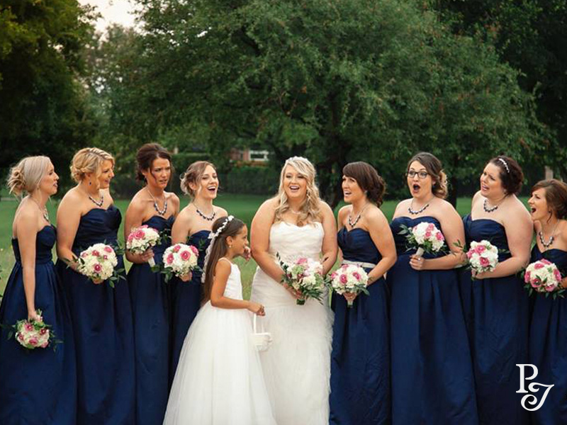
Asia Joy is a photographer who captures beautiful moments that is intended to be both artistic and document a point in time.
Some time ago, I hand-lettered a design that acted as a personal logo, but also as a signature she could put in the corner of her photos because the slight angle the logo sat on balanced nicely with the edges. With the revamp of her website and her branding, the angled logo was no longer applicable, so a centered and more equally balanced logo was needed.
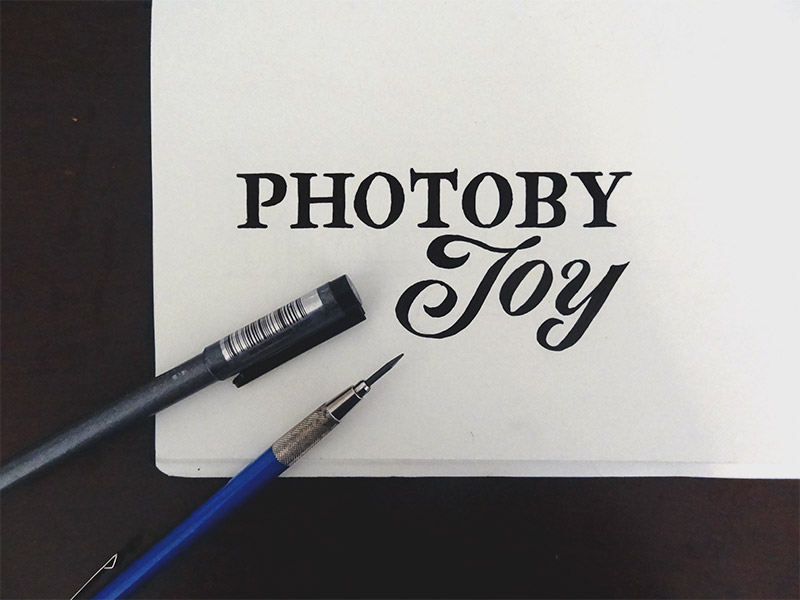
Asia enjoyed the contrast shown from the initial logo between the serif type, which showed the business side, and the hand-drawn script style, which showed the artistic side, and wanted to incorporate this into the new identity. Another necessity was that parts of the new logo could be brought together to form a monogram that could be used as a signature on the photographs.
With these considerations in mind, I set out to design a logo unique to PhotobyJoy.
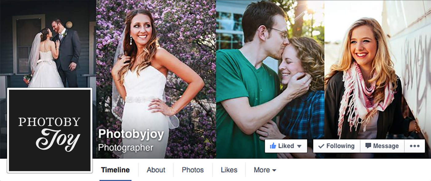
Old logo for Asia Joy
Application of old logo
What the brand is
Friendly, Personal, Artistic, Simple, Bold
What the brand isn't
Editorial, Uninspired, Bland
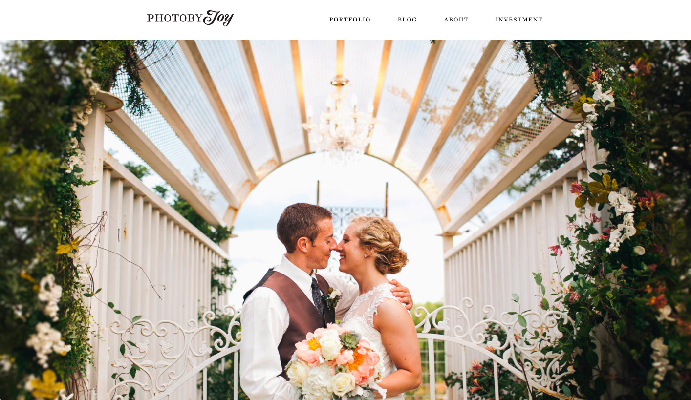
The logo was drawn to work horizontally within the context of the website, but can also stack on each other to fit into narrower spaces.
It was also designed for the P and the J to come together to form a monogram and yet still show the contrast between the serif and script styles so that there is consistency when the logo is both collapsed and expanded.
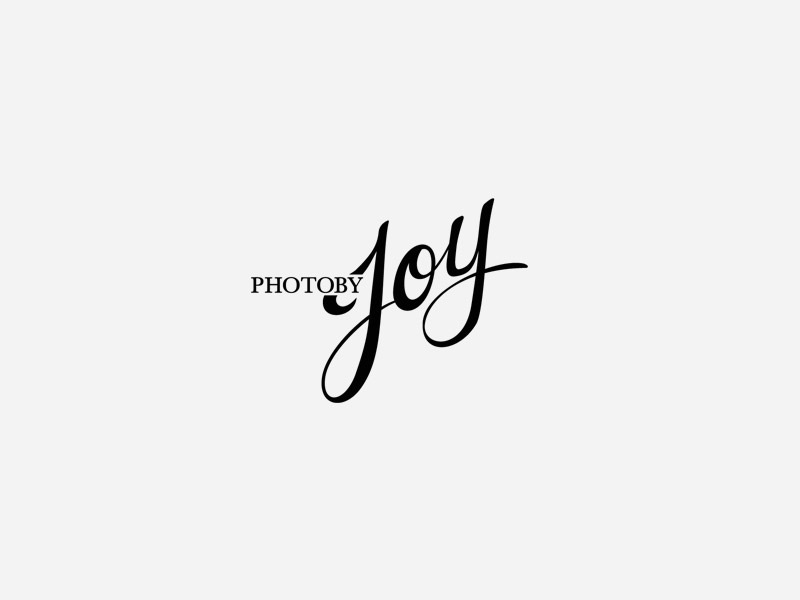
A custom serif type unique to the Joy brand comes together with a script style to show the sides of both professional and artistic; this creates a logotype that can be easily applied onto any medium through its ability to stack or collapse into a monogram.

Recent Portfolios
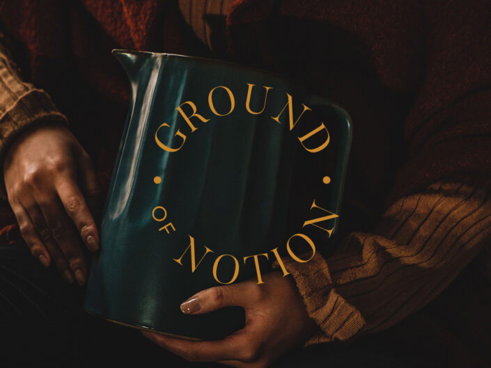
Ground of Notion - Lifestyle Decor Ecommerce

Mise En Place Talent - Hospitality Recruitment

Fratelli Famous Pizzeria - Restaurant Branding